High-level goal
In early 2020, Adobe announced that it would stop releasing updates for Flash Player by December 31, 2020, and web browsers would stop supporting Flash. Prezi Classic, which ran on Flash, used to give us a competitive advantage. We had to make sure that Prezi Present supported Classic content after the discontinuation of Flash. So it's easy to open and edit Classic presentations in the Flash-free Prezi Present editor.
I had to redesigned the navigation and animations in the Present editor to ensure easy access and editing of Classic presentations.
Context
Prezi was founded with Classic in 2009, which featured an open canvas where users could add, organize content, zoom in on details and connect various elements along a path.
Navigation in Prezi Cassic
When Adobe announced the end of Flash support and advised developers to switch to HTML5, some of our engineering teams started developing a new Prezi product using HTML5. This allowed us to rethink the basic structure of the presentation tool.
In 2017, Prezi released a new product called Prezi Present, which provided a predefined but extendable path as a three-dimensional structure of the presentation.
Navigation in Prezi Present
Problem and direction we took
History of the project
There was a lot of tension related to migration between the two Prezi products. We knew from forums and support tickets that our users were very frustrated and worried about the future of their Classic presentations. Since the announcement of the end of Flash various designers have attempted to tackle this project. However, higher priority projects within the company often slowed progress and some of the critical stakeholders departed during the process.
When I joined the project, lot of explorations, ideation, and research had already taken place. Therefore, I had to dive deeply into the project's history to gain a thorough understanding.
What has been done before
In the inherited design, the navigation concept contained a two-tab navigation sidebar. The first tab, "Structure," allows you to view the overall structure of your "Topics" similar to a typical folder structure. The second tab, "Timeline," allows you to view all the steps in a sequence, including animations and steps inside "Topics."
The intention was for Present users to see the "Structure" tab by default since it is similar to the navigation sidebar in Present. When they add an animation, the view would switch to the Timeline view to see the sequence together with the thumbnail steps. Classic users, who do not have topics in their Prezis, would arrive at the Timeline view by default and see all their content, such as "Zoom areas," "Zoom to objects," and animations.
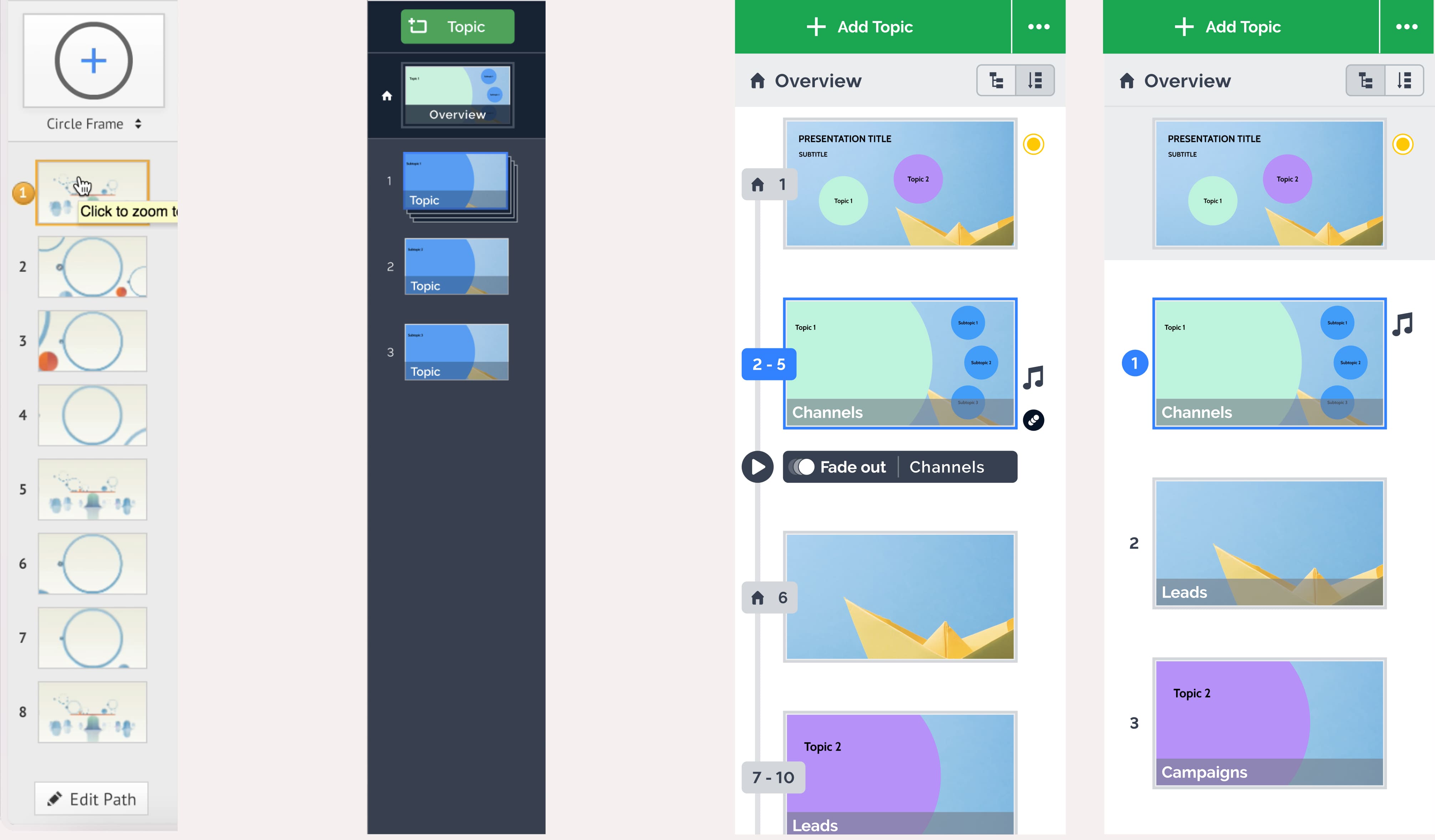
Prezi Classic navigation sidebar - Prezi Present old navigation sidebar - and the inherited “two tab” proposal
Challenge: navigation
The biggest challenge of the project was to solve the navigation differences between Classic and Present. As shown above, the inherited design had the two-tab approach. But I also did a lot of explorations to see if a one-tab version could work. There I merged the two tab versions so that it visualizes the structure of the presentation and shows all the animation steps, and indicates the number of additional steps in a particular "Topic."
We were uncertain about the direction we should take, fearing that introducing more elements to the simple navigation sidebar used by Present users would make the interface more complex. However, we had to find a way to display all the path steps for Classic users transitioning to Present without hiding any behind a folder structure. Prototypes for both versions were tested among users, but it was difficult to determine which was more successful.
Engineers in the team believed in the one tab version so much that they were willing to build it even though we weren't sure if that would be the final version. This allowed the UX research team to conduct more thorough testing.
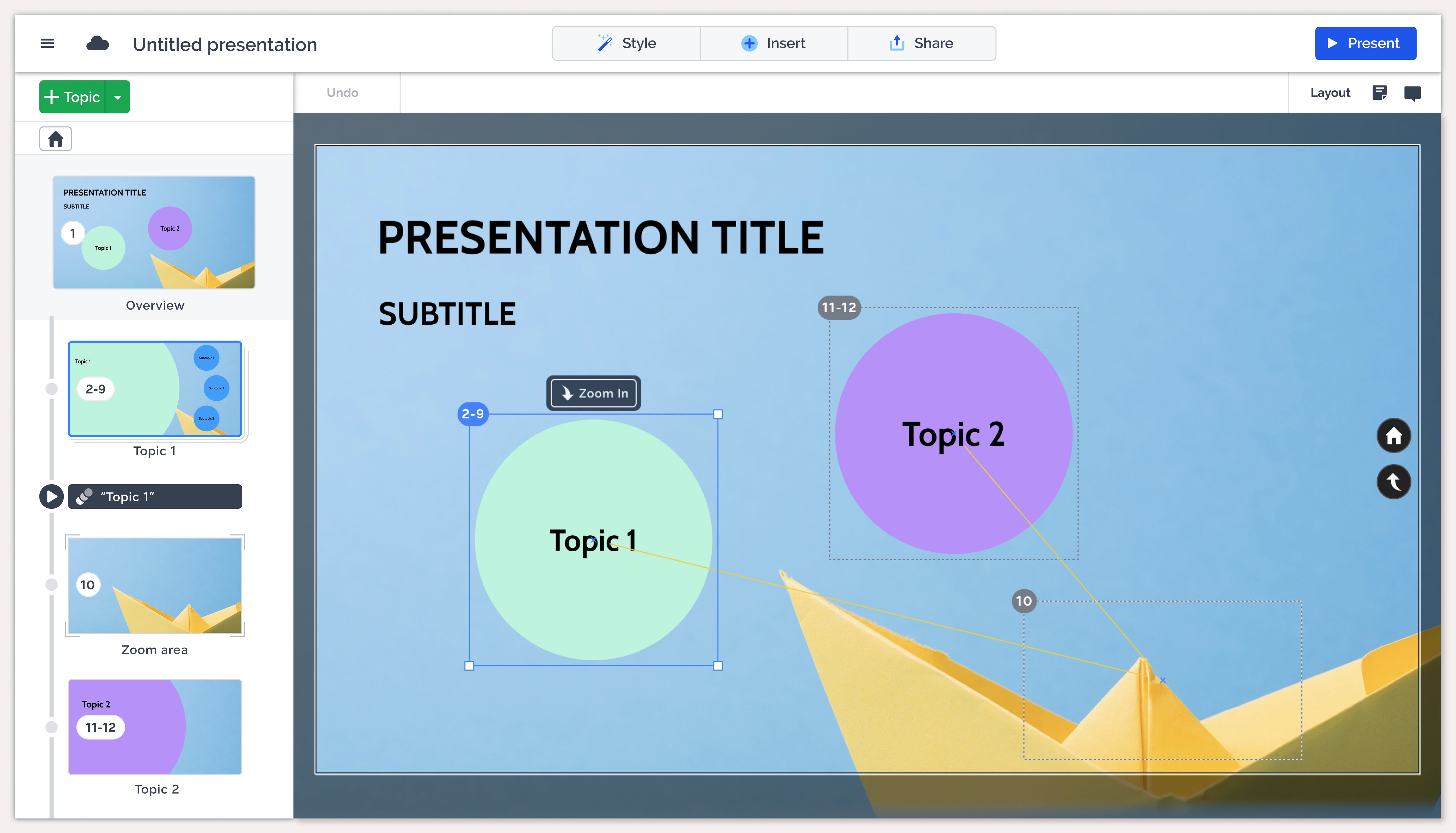
Prezi Present navigation sidebar
We were able to test our design concept version with 200 volunteer Prezi users, who migrated over 700 Classic presentations in a two-week testing period. Testers were able to report issues they found through a form, also a dedicated Slack channel was set up to provide direct support to them.
Results were promising. Migration experience got a rating of 4.3 out of 5. We were pleased to see that the majority of users found the migration process to be satisfying, and were impressed with the functionality of the Present editor. Throughout the test period, we received numerous issue reports from the testers, and I prioritized the top twenty high-priority issues for immediate attention.
Design details
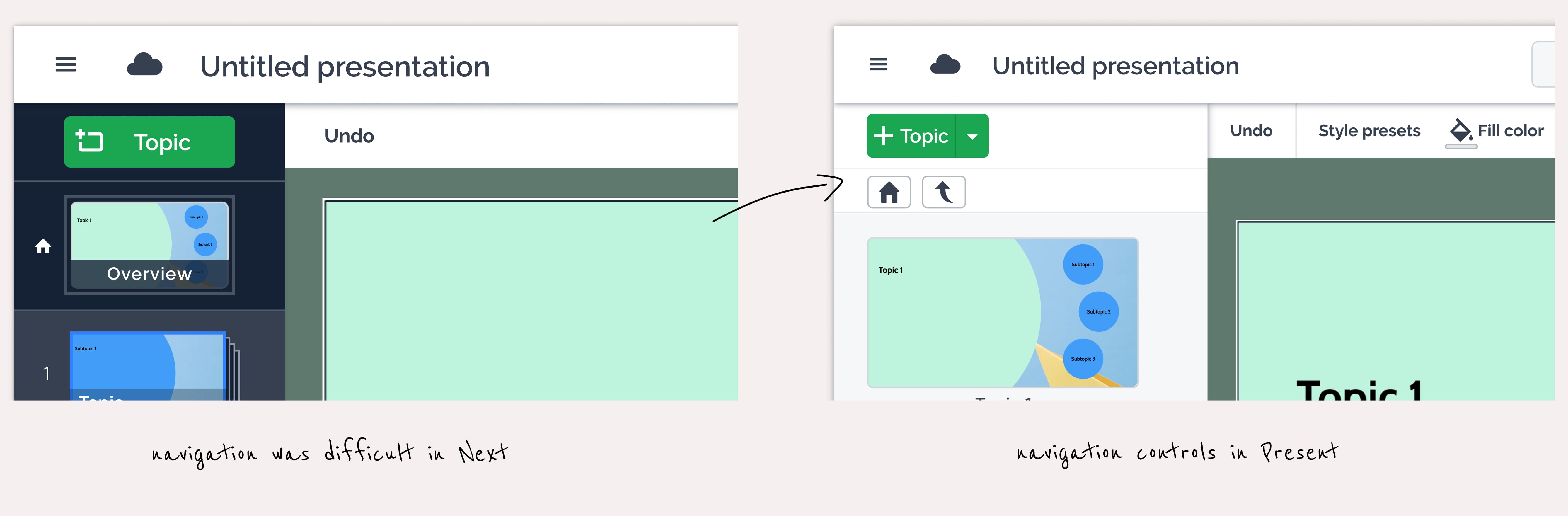
I iterated a lot on the navigation functions to ensure they were easy to understand and use. The final version of the navigation bar clearly displays the selected Topic and indicates if it contains any Subtopics. I also added a clear option to easily navigate one level higher or directly to the Overview.
I had to visualize the different types of path steps - such as Topics, Subtopics, Zoom steps, and Animation steps - to make the navigation sidebar more informative.
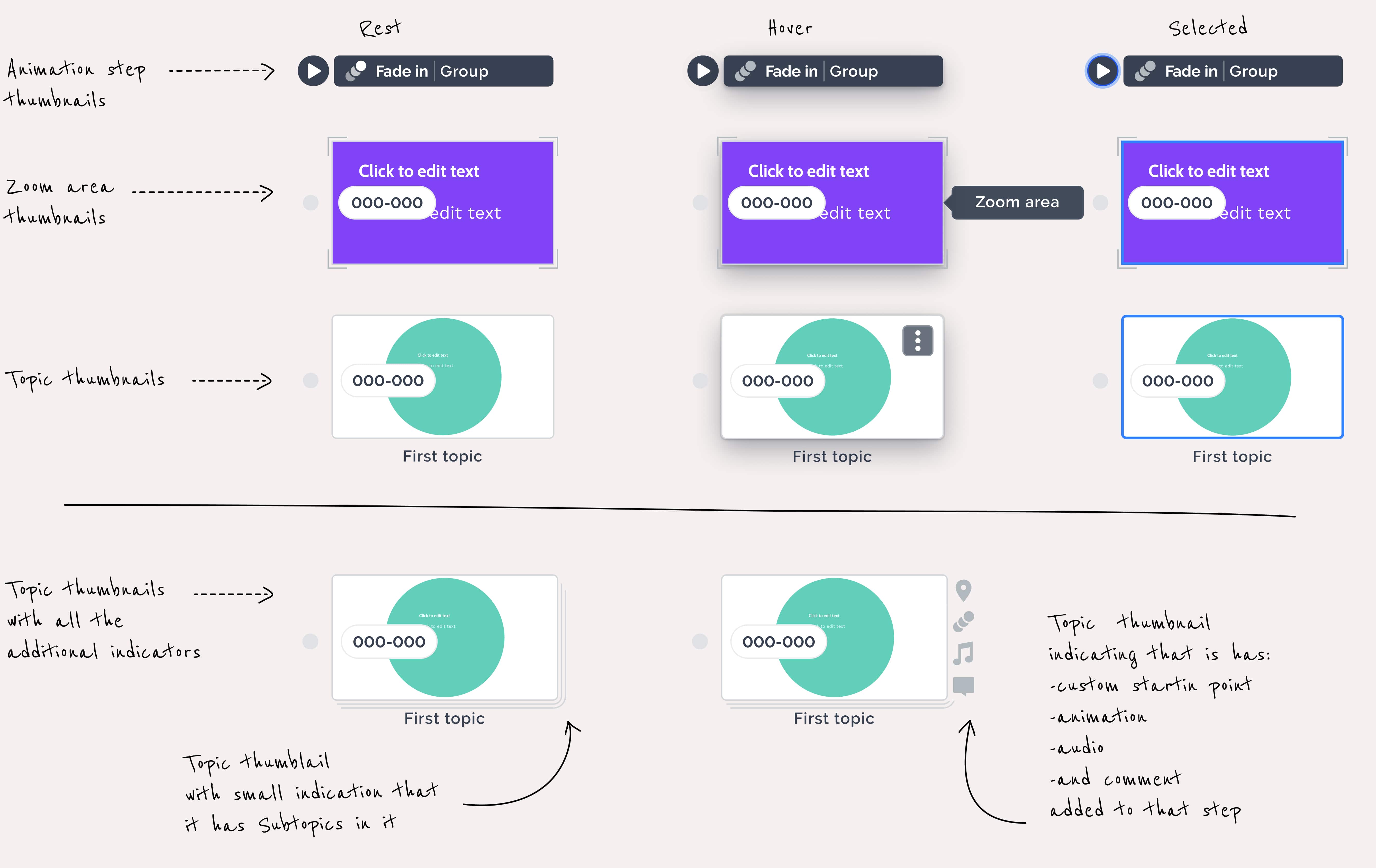
Also, I had to indicate some possible functions on a particular path step thumbnail including the ability to add Audio files, Presenter notes, Comments, and set the Custom starting point. To maintain a clean visual appearance, I decided to use small icons to indicate if any of these functions were used on a specific path step.
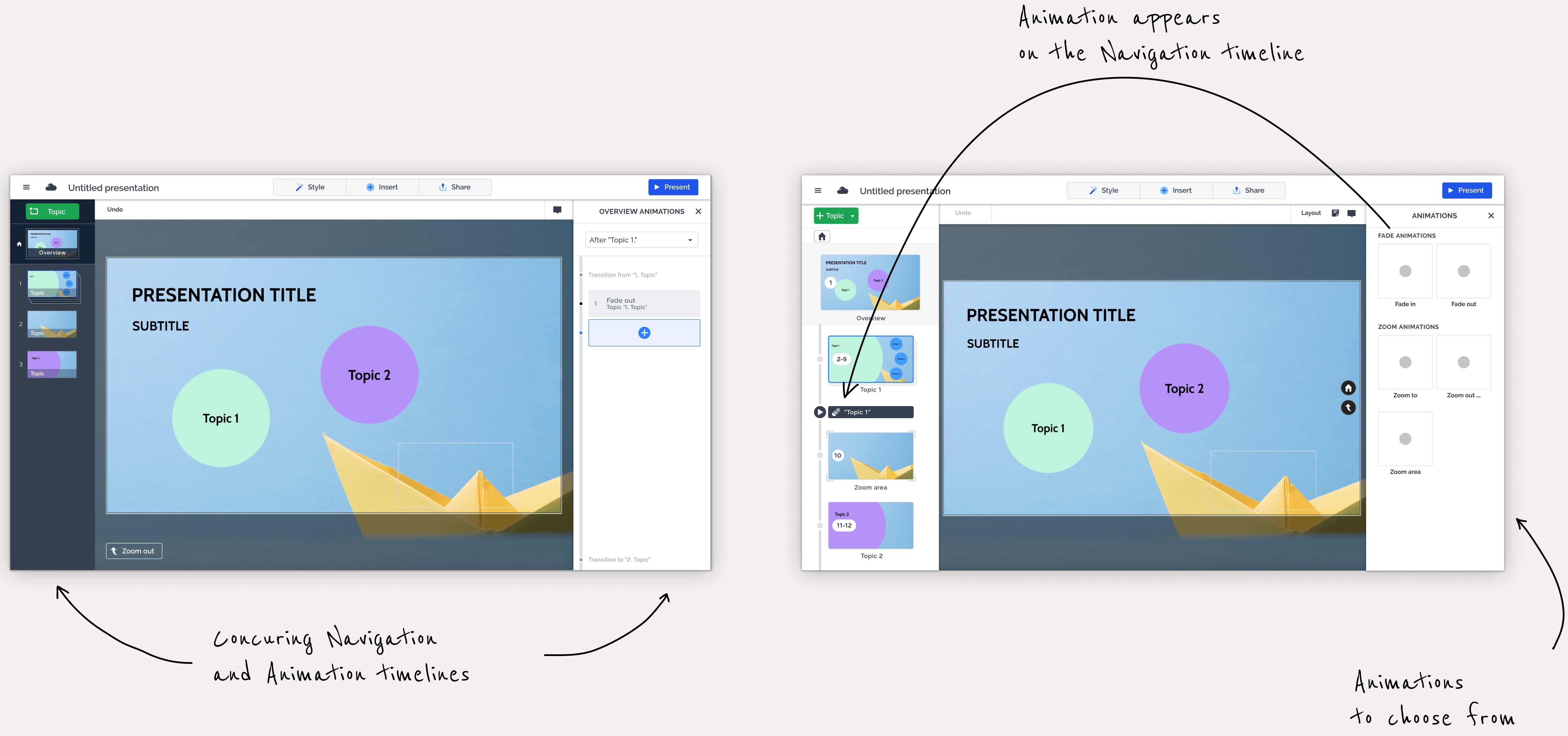
Connected to the navigation problem space, I also tackled animation problems. The existing option to add animations, such as Fade in, Fade out, Zoom to, Zoom out, and Zoom area, was overly complicated, and the dedicated animation timeline was misleading. To simplify the process, I kept the animation sidebar but limited it only to list the available animation types. Any added animations would appear on the navigation sidebar as standalone path steps.
Result
Since the release of the new version on November 14th until the end of the month, over 9,000 unique Classic users (including both free and paying users) have converted more than 12,000 Classic Prezis to Prezi Present.
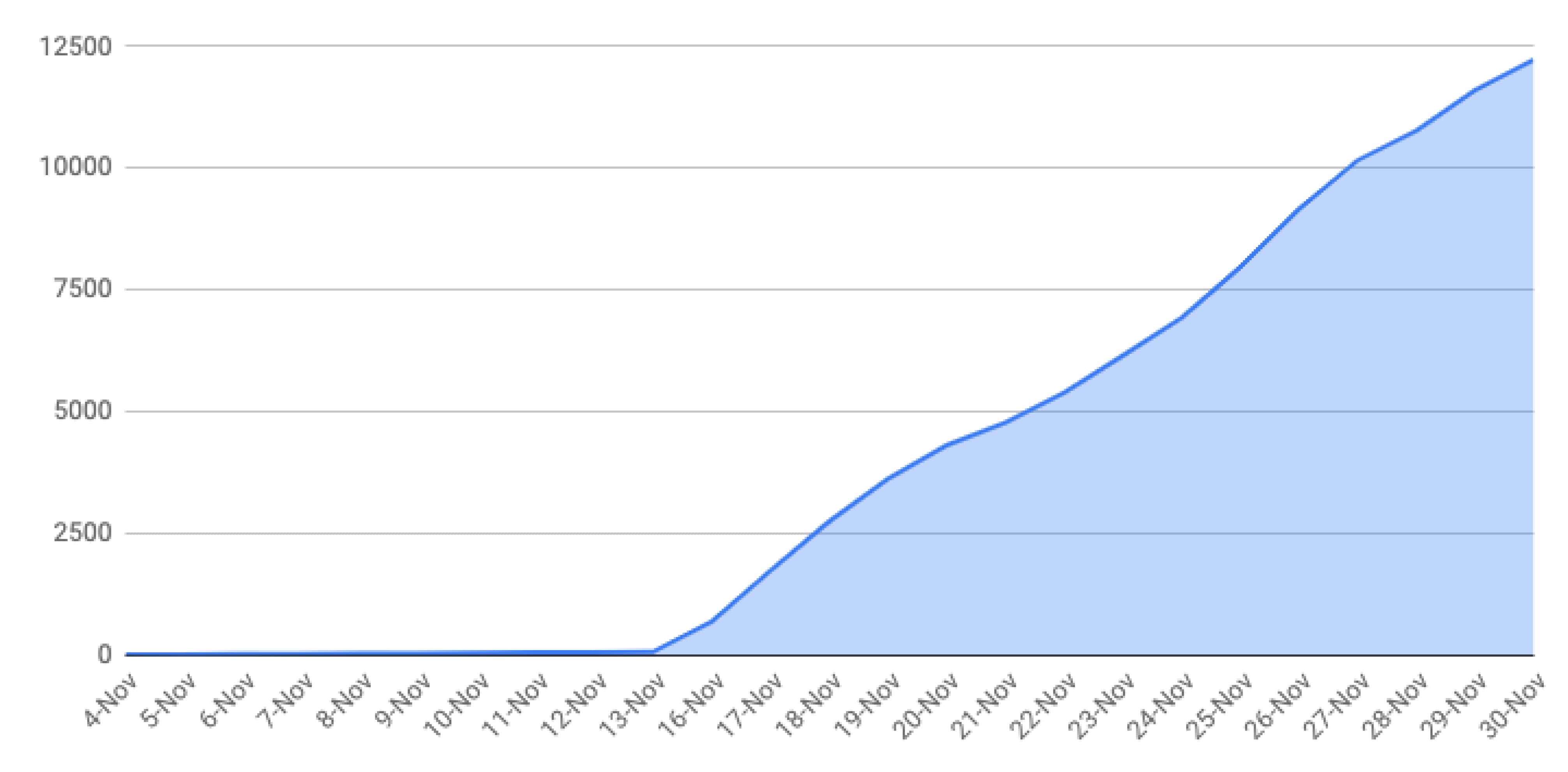
Classic to Present coversion total from 1st of November to 30th of November
Despite the significant number of conversions, our support and social media channels remained relatively quiet. This was a positive indication that we didn't encounter any significant problems during the conversion process. Although some customers had questions about changes in the editor, we have not encountered any critical issues so far.
Learnings
I joined an advanced engineering team of mostly senior-level engineers for a complex project. Working with them required a flexible design approach. I realized that this active collaboration is the most close-fitting way of working for me in a cross-functional team structure.
This project was also a great opportunity to hone my design skills. Despite the relatively small size of the sidebar area, I had a lot of complex components, interactions, and features to diplay.
Impact
On January 12th, Adobe blocked Flash from all browsers and and we finally shut down Prezi Classic. Fortunately, we were able to retain our classic user base, and managed to save about $4-5 million per year. Although the exact numbers are unknown, that was the order of the risk.