It all started with Zoom becoming a platform
In 2020, Zoom is a top app by number of customers and by active unique users. In 2021, Zoom took a step further by introducing Zoom Apps. This allows users to access best-of-breed applications, throughout their Zoom meeting workflow, to be more efficient before, during, and after their virtual meetings. Prezi was one of Zoom's official launch partners to enable Prezi Video right inside any Zoom video call. This means that anyone with any presentation deck can quickly present their slides next to them in their video feed.
Presenting changed completely
From our discovery research, we learned that presenting changed over the last year. Remote presentation is the primary way of presenting. Screenshare is the number one solution for sharing visuals during an online presentation. It's an easy, one-click, and well-known solution to show your content over a video call.
Main frustrations with Screenshare:
Prezi Video is offering more engaging ways to present online. Unlike screen share, Prezi Video lets you interact with your visuals on screen, use your body language, facial expressions, and point to specific parts of your visuals to deliver a more engaging presentation.
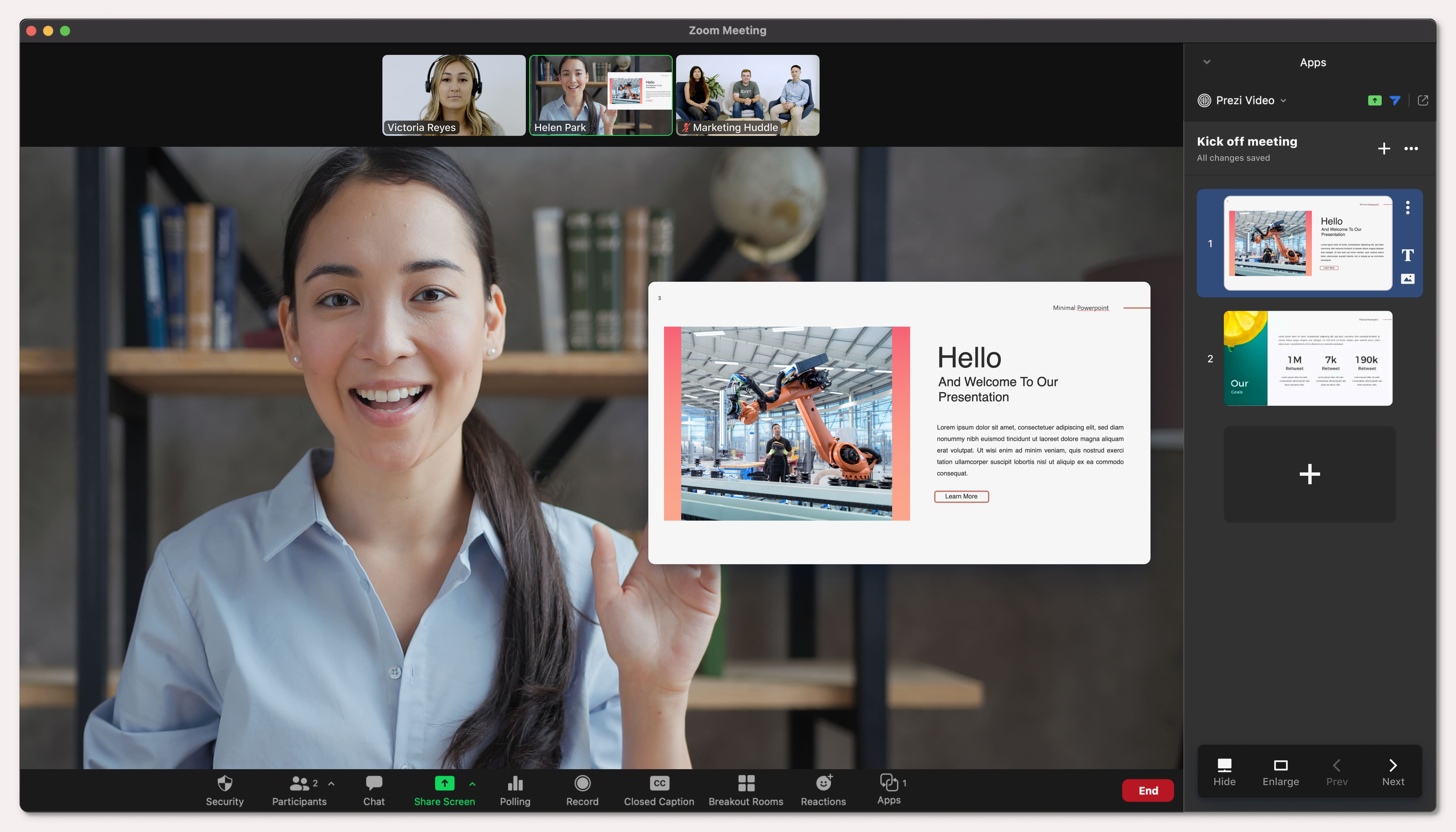
This opportunity came when the company decided to redesign Prezi Video editor. We wanted to step away from the first version's wizard approach. And design a more convecional editor where all the functions are accessible at the same time.
Faster to success
I worked with the Product Leadership and Marketing team to identify what we can offer Zoom users when they have access to Prezi Video right inside Zoom. We defined two primary goals for the project:
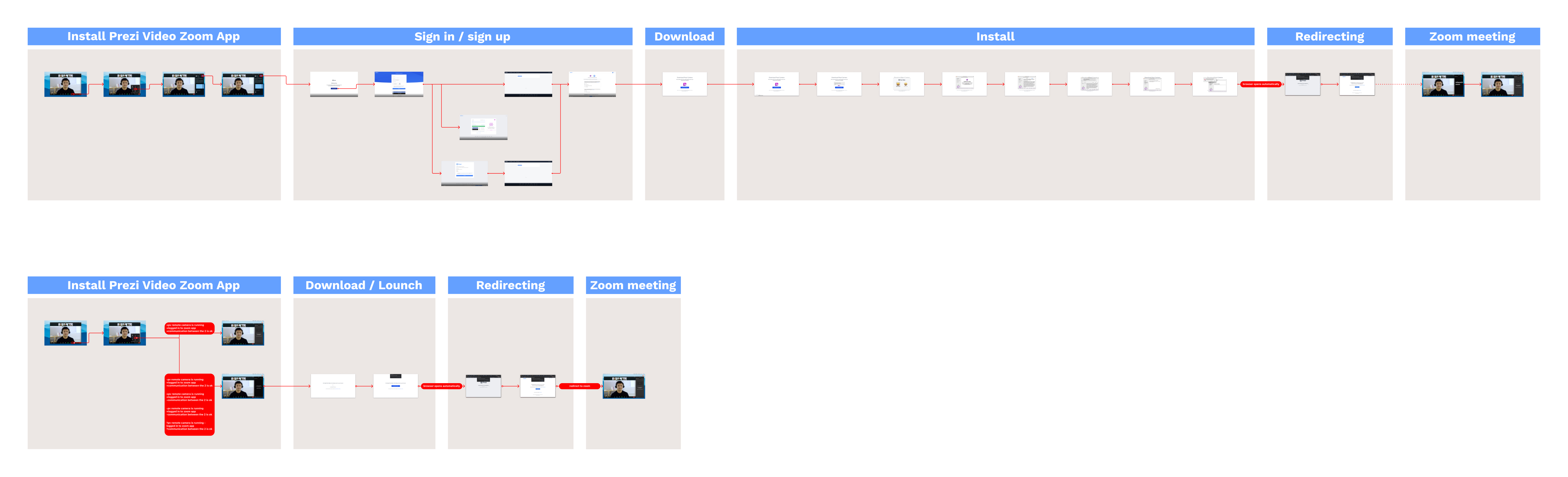
Install Zoom App + Download Prezi Camera and Opening Zoom App - second time
However, our app turned out to be different from other Zoom Apps in terms of the necessary account creation and virtual camera installation, which can make the first-time experience significantly longer.
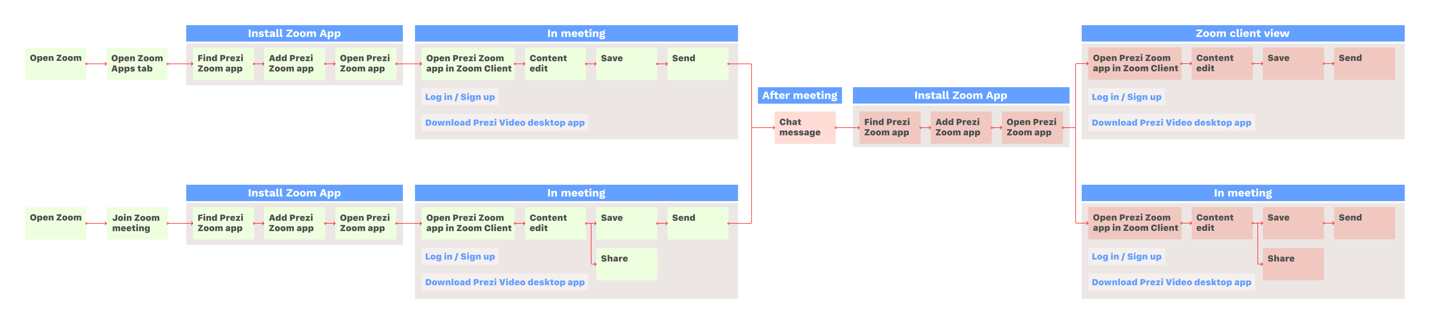
Zoom app - pre meeting - meeting - after meeting scenario
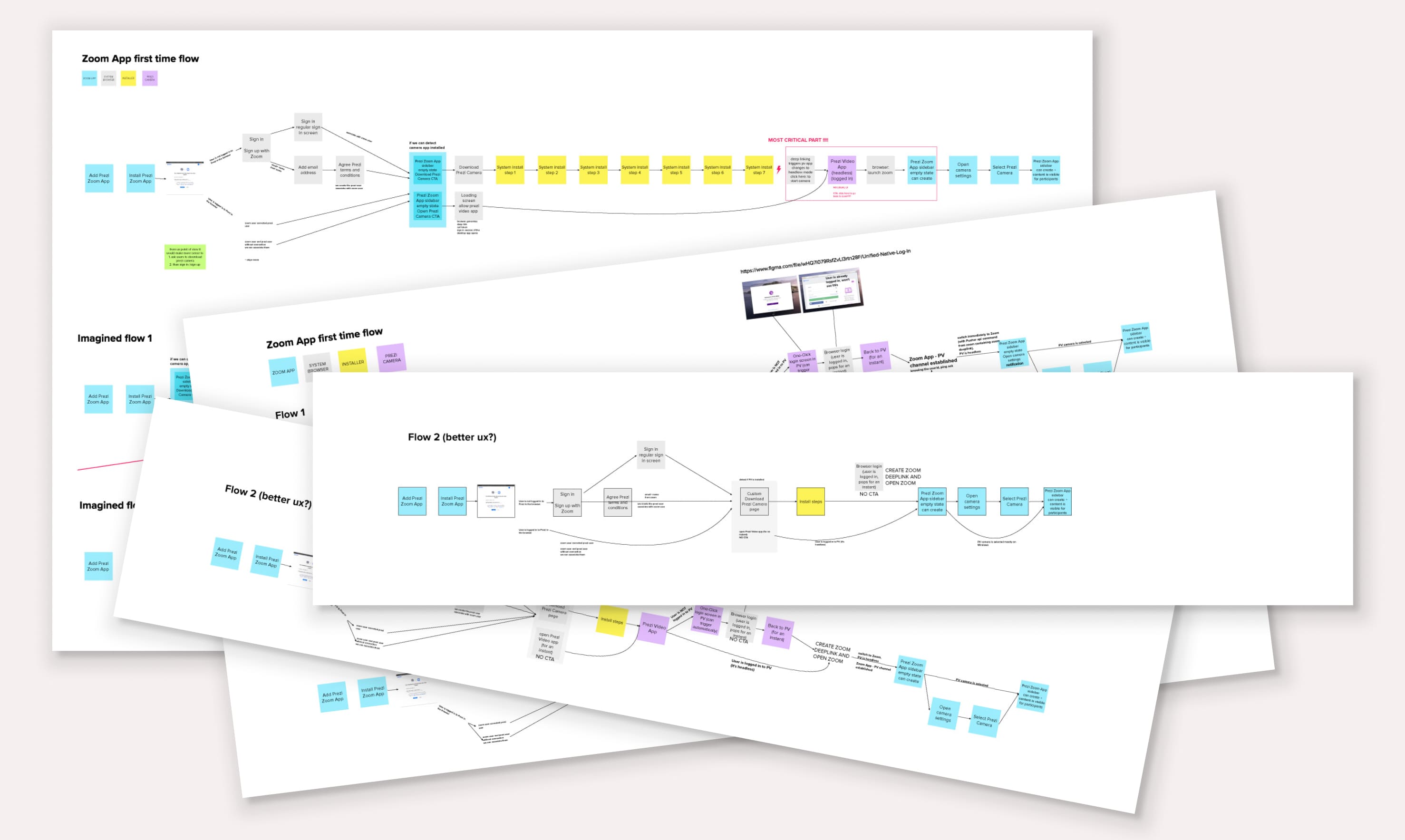
The most challenging part of the first-time user experience was reducing the number of steps until users could try out the tool. We had to consider many technical constraints to comply with our security requirements and work with our current document storage solution. To offer the same Prezi Video experience within Zoom, we had to use a virtual camera. This basically means a new item on Zoom's camera list without using any external camera source. This was crucial to ensure that users don't have to juggle between two apps during a virtual presentation. Downloading our virtual Prezi Camera also meant additional fiction. I had to communicate it clearly, and explain the difference between a web camera and the virtual "Prezi Camera." This required clear UX and carefully selected wording throughout the whole flow. Although we could not reduce the number of steps as much as we intended, I managed to design each step in a way that there is always a single, clear action that lets users proceed.
Compact app interface
Our goal was to design such self-explanatory UX that there is no need for wizard structure or additional onboarding steps. The challenge was to use only the sidebar area Zoom dedicated for the integrated apps. We assumed that the key to success would be showing your content next to you as soon as possible.
To maximize the limited space in the Zoom sidebar, I created an information architecture that prioritized the most essential functions and communicated the project scope effectively.
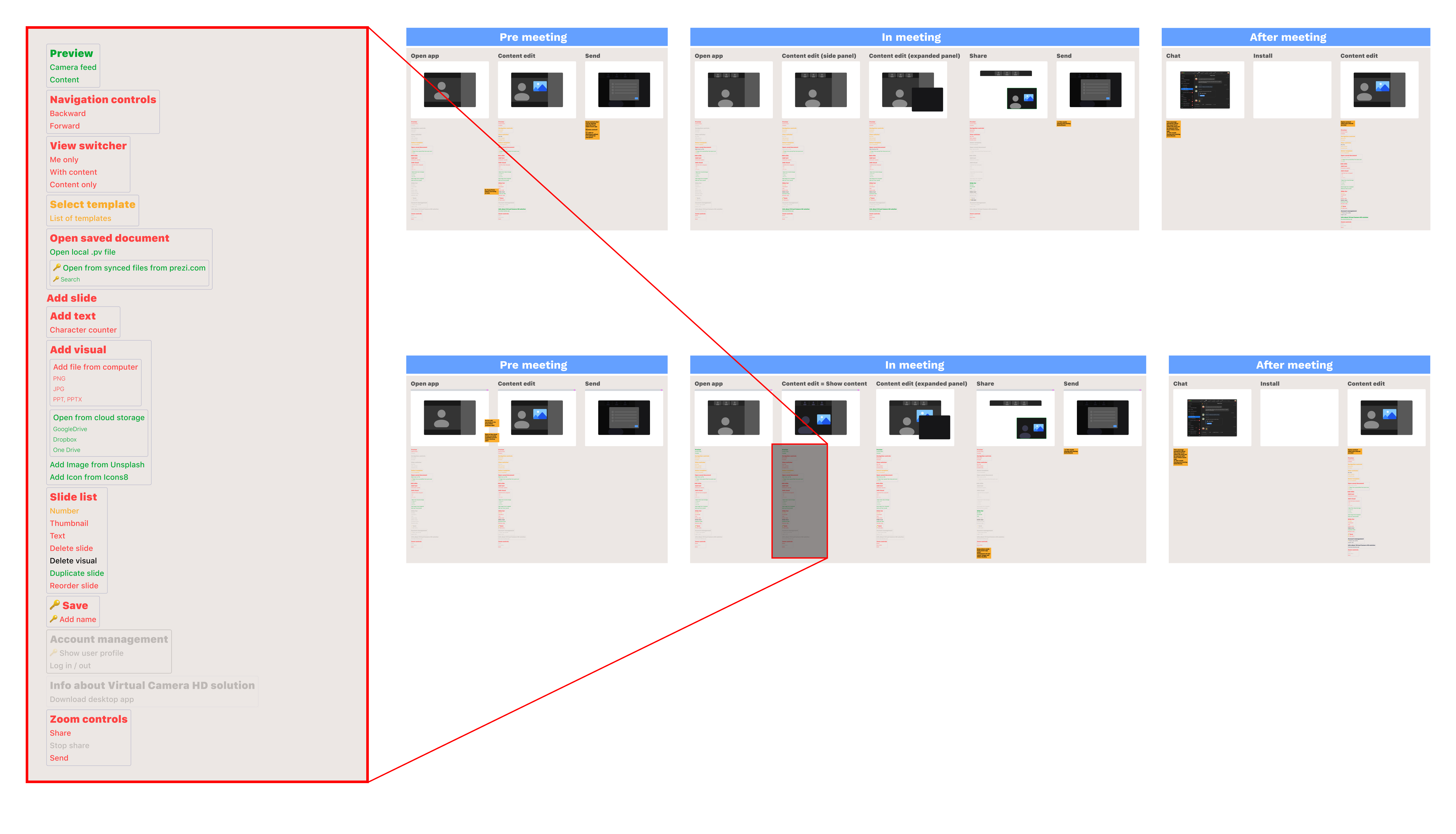
Most essential functions (highlighted with red): Add a new slide and bodytext or image; Show the slide list; Give the option to navigate through the slide list; Show or hide content from the screen
Design details
I learned from user testing that although the sidebar is a small area, users were able to find every function they needed. They could immediately import their slide decks, it was clear for them how to add new content, and they had no problems managing and editing slides.
On the other and, I realized that people couldn't distinguish between the Zoom interface and the Prezi App. For the first version, I used Zoom's color palette and type scale. The original assumption was to mimic Zoom's UI, so we have a seamlessly integrated panel inside Zoom. We needed to fit into Zoom but not blend in.
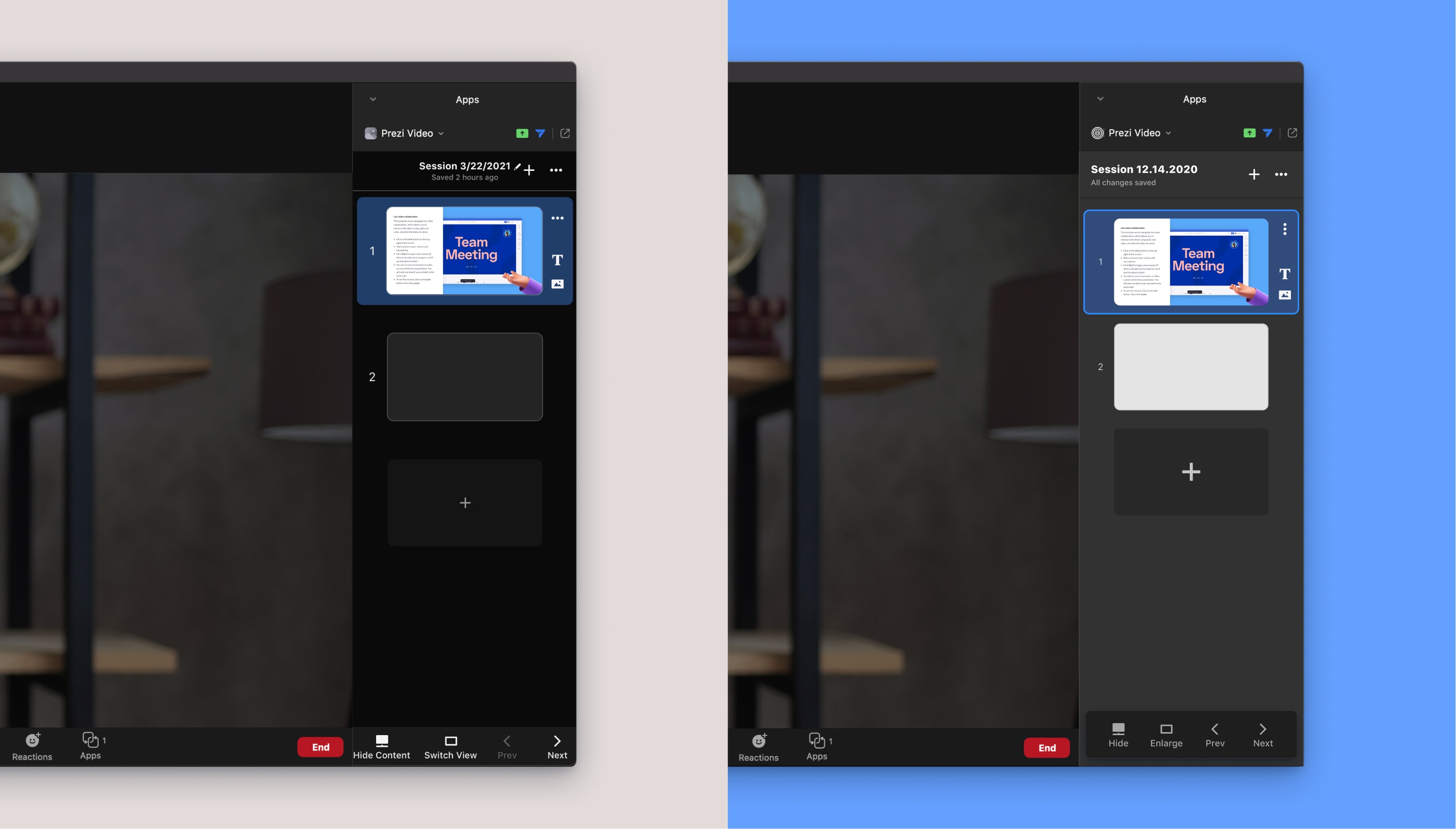
Before / After: Prezi App Slide list and navigation
Designing for and unexpected usecase
After successfully trying the tool, users could save, name, reuse the presentation in their next meeting. The usual autosave option didn't work in Prezi Video's case. Based on tests and internal usage, we saw that sometimes people just want to react with a few lines of text or an image without verbally interrupting the meeting. These are more like chat-like reactions, and they are not relevant anymore after the meeting ends. Therefore, we offer a manual save option at the start of creation. Autosave is available for users who intend to keep their presentation.
Challenges and benefits of an integration project
Working on integrations has its difficulties, collaboration, and coordination challenges. In this case, it was even trickier since we created an integration to a work-in-progress platform. So we had to adapt to Zoom's pace of development and wait for their solution to build on it. On the other hand, the fact that we got early access to Zoom's new platform gave us many advantages. We were able to request technical adjustments during the development process and use the benefits of Zoom's existing features. For example, Zoom allowed us to pull in the meeting title as the title of our document. This made our "History" list much clearer and easier to search.
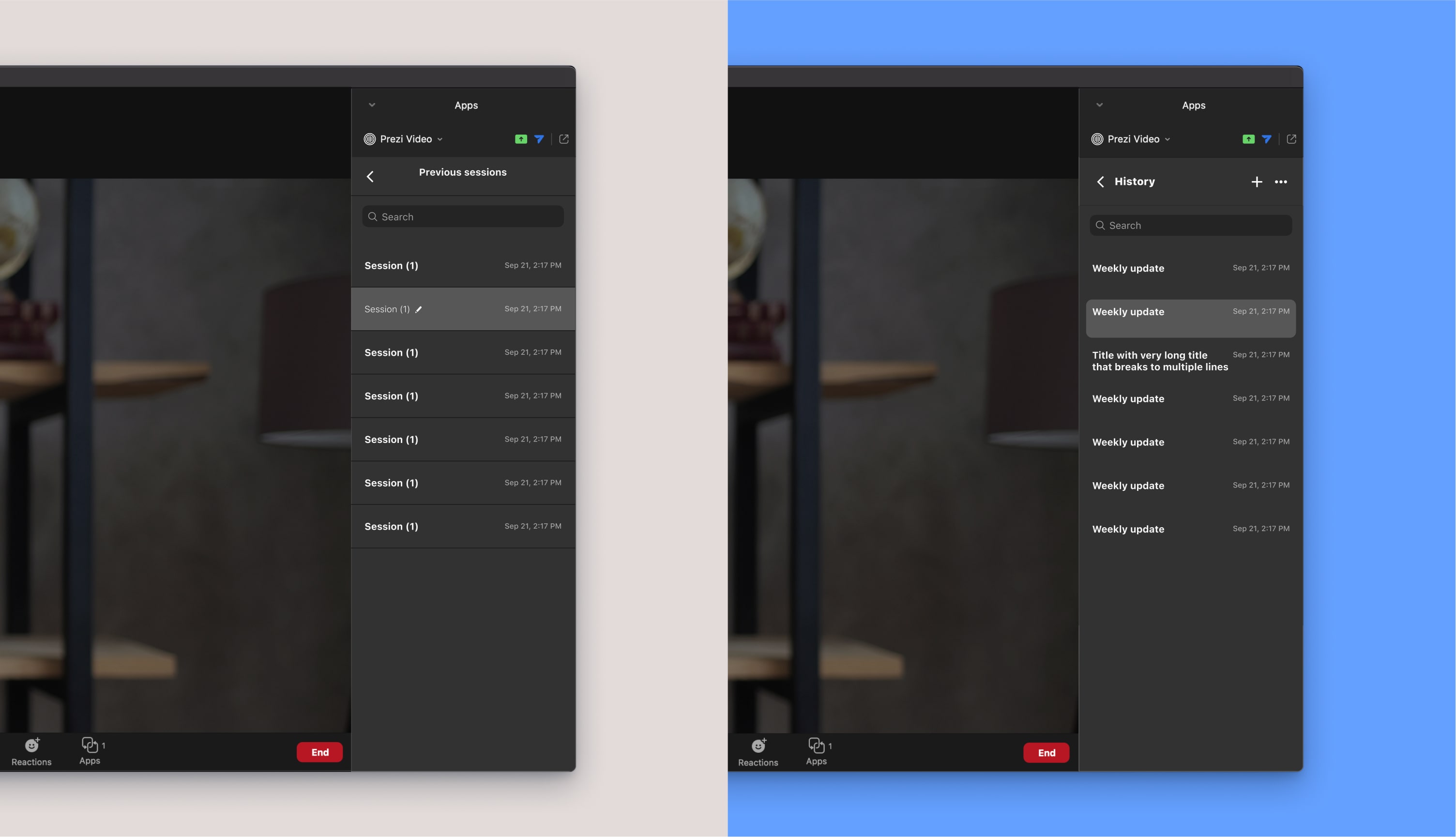
Before / After: Prezi App History
Integrating our tool into a different product also had copy-related challenges. Our "switch view" button was mixed with zoom's view modes. So we had to come up with some different but clear naming for our view modes. With the new copy "Large" and "Small," we could refer clearly to the visualization of content in the Prezi Video app.
Lessons I've taken away from this project
I learned a lot from the team setup of the project, which involved a cross-functional team consisting of engineers from the web and native teams in addition to the usual roles. This allowed us to consider technical specifications of all platforms from the very beginning of the project.
We also stepped away from the usual, rigid handover culture between design and engineering. We ideated together to come up with the best possible solution. For example we had a lot of back and forth on the installation flow. I helped engineers visualize the flow to see UX problems clearly. Engineers helped me to understand the technical limitations and possibilities.
Results
Based on the learnings from usability tests and feedback from internal usage, we learned that the compact sidebar version of Prezi Video is easy to use, and people have no major problems interacting with it. Once the app was set up, it was fairly quick to achieve the wow moment when the content appears next to you on your camera feed.
The Zoom app integration already started to inform and influence the development of Prezi Video 2.0. We are confident that the compact sidebar, the slide list, and the clear options to edit and present will be helpful for our Prezi users too.
Also, as a result of this project, we have a solid relationship with Zoom. We've already been invited to their layers API to work together on a better environment for the Prezi App. This will open up new opportunities to improve and simplify, for example, the app installation flow.