Why did we need a new icon set?
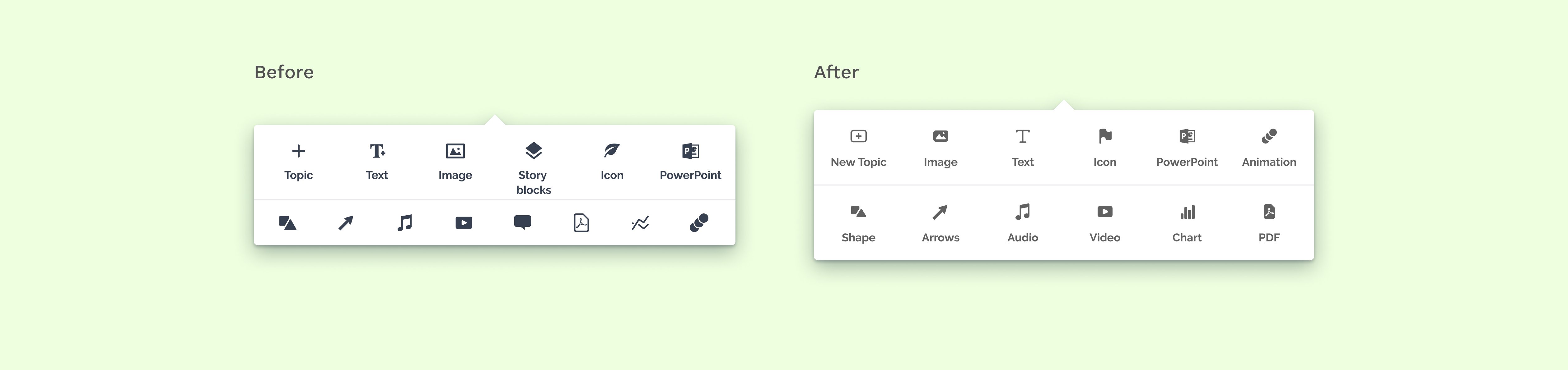
Over the past two years, our team at Prezi has been diligently working on developing a cohesive design system. When I initially took on this project, our icon set was sourced from various icon fonts and new icons were added on a project-by-project basis. The goal was to build a universal icon system that improves all-around UX by making icons more understandable, thinking through their semiotics, and making icons consistent.
But why not purchasing one?
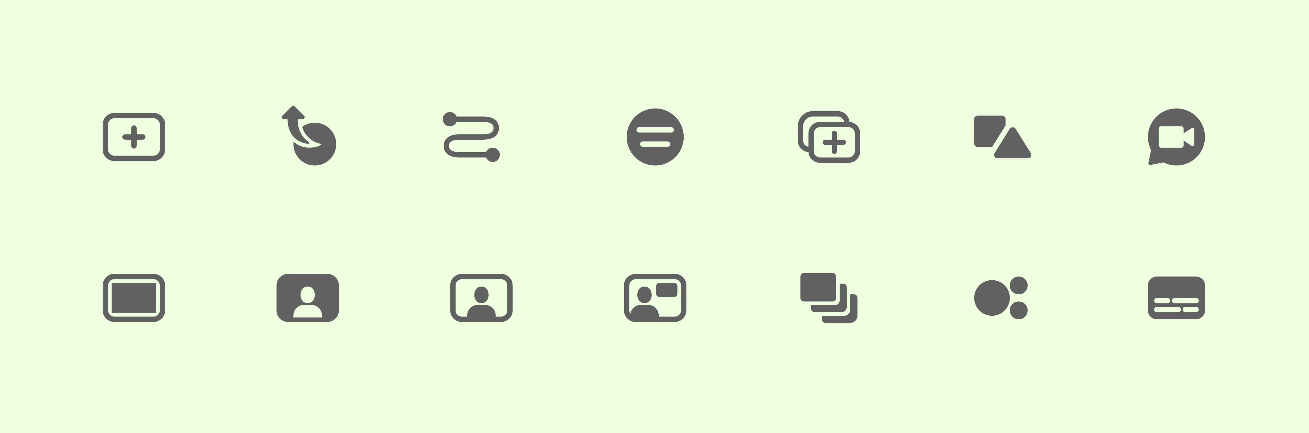
One of the biggest challange was the Prezi-specific icons with complex meaning and therefore complex visual representation. For instance, within the editor, there are options such as "Add new topic," "Zoom out from a topic," and "Edit path." These are unique terminologies that are specific to Prezi and have very few industry-standard examples. On top of the usual requirements, this special scalability was the most needed feature for the icon set.
How did I start?
Collecting problems on a design review
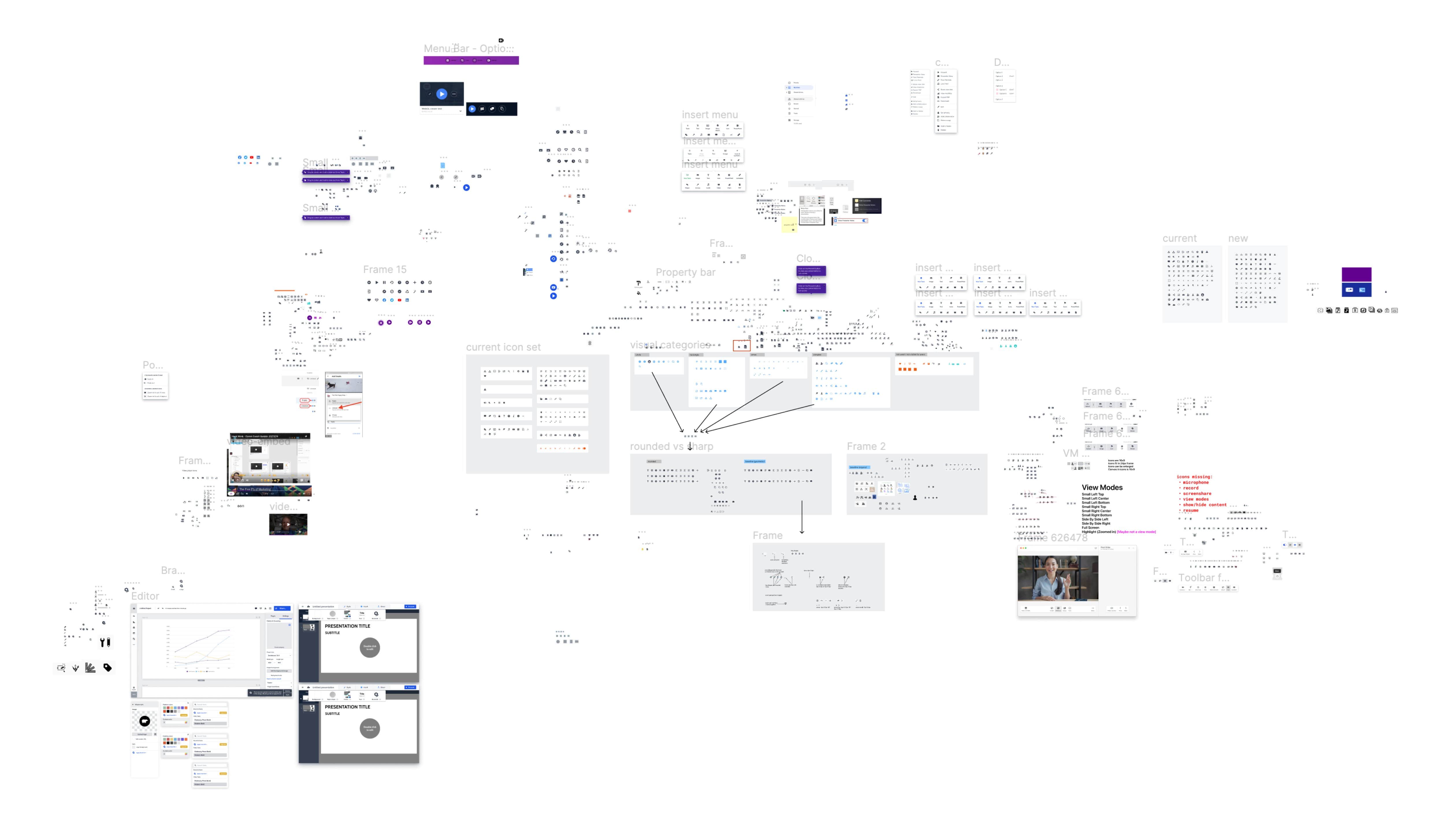
To examine Prezi's icons in their proper context, I organized a discovery session with designers from various teams. We examined screenshots of the Prezi UI and identified inconsistencies and problematic areas. By using Miro, we were able to easily flag these issues and collect our notes. Through this process, we found a lot of inconsistencies, varying icon styles, and random sizes and colors.
Basic guidelines, stylistic direction
As a first step, we set basic rules and directions in order to create a cohesive and extendable icon set.
Stylistic decisions have been made, like we prefer flat icons over perspective, we would rather use geometric shapes over organic imagery. We spent time reconsidering some metaphors and chose the direction to use literal rather than abstract imagery.
Once we agreed on the high-level direction, I began working on the actual guidelines, starting with a base size of 24px by 24px for product icons.
Defining

However, in a project like this, you can not work isolated inside your grid for too long. So I tested the redesigned icons on real UI and compared them to the original screenshots to see if I really improved discoverability, consistency, and semiotics.
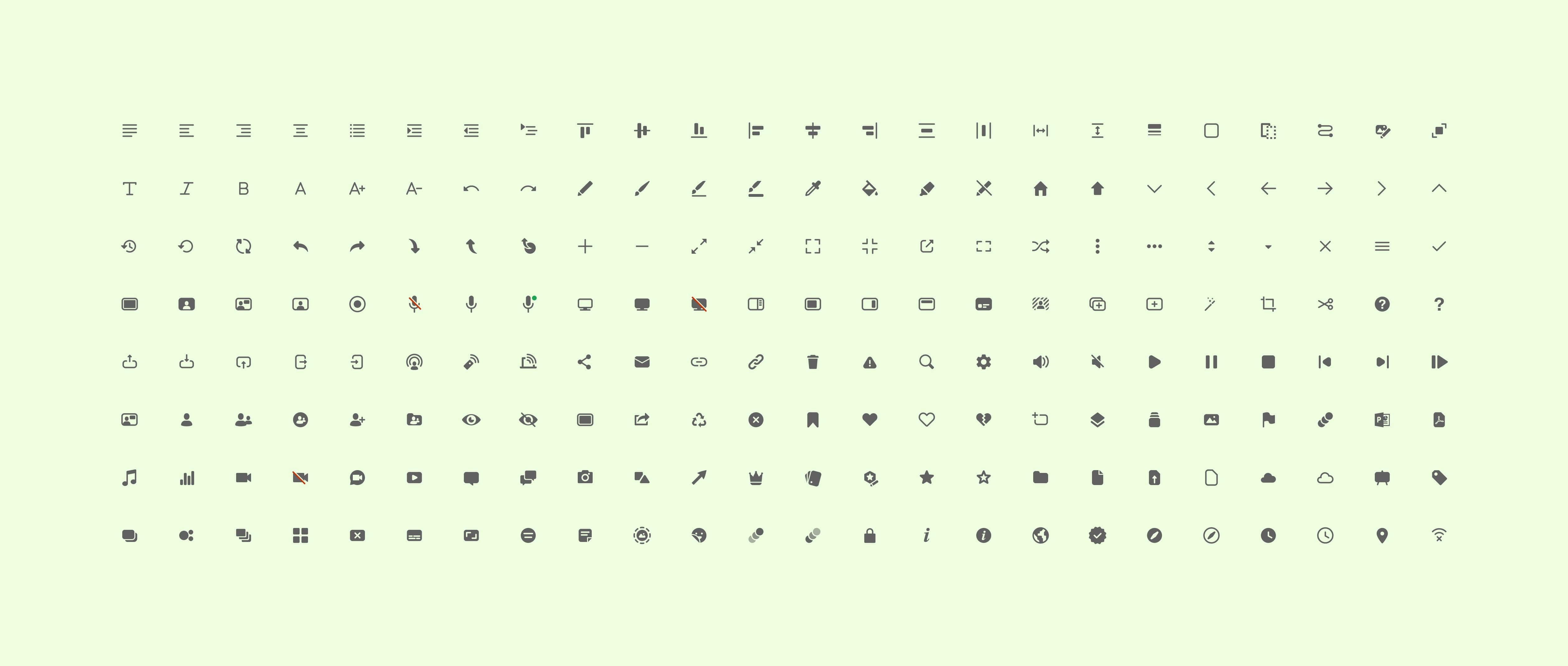
After setting the basic guidelines I focused on unifying building blocks, stroke weight, white space, corner radius, and end caps. Icon colors were selected based on color contrast and accessibility, utilizing our secondary brand colors.
Challenges
Scalability
As we developed the new icon set, we faced new challenges, particularly with scaling. To address this, we initially created a "Large" icon set that included only the icons we needed in a bigger size. Later on, when a request came in for an intermediate size between the small and large sets, we took a different approach. We decided to allow the design team to scale the base icon set with certain limitations, in order to achieve the necessary sizes.
Technical details: naming, grouping, API
During the process we also faced some challenges naming and categorizing the icons. After some discussion, we decided to name the icons based on their functions to avoid any confusion.
However, grouping icons into categories was even more contentious. Each designer had their own mental model of how to categorize the icons. After conducting some in-house research we discovered that fewer categories helped more to navigate and find the desired icon. Some icons naturally formed groups as they appeared on the same part of the UI in the product. However, certain icons did not fit into the same group, so we agreed to iterate on categorization.
The design department decided to use Prezi API, so most of the UI components, including the icon set became API components. This way Prezi's design system is more extendable and easier to maintain. For designers, I organized all the icons in a Figma file. If they use those components, they will get an instant notification when any update happens on a certain icon. Developers can easily access the icons from the API components, which are updated and aligned with the latest design changes regularly.
Tweaking icons together is more fun
Redesigning industry-standard icons was straightforward, but designing unique Prezi icons proved to be challenging due to the complex functionalities they represent. Traditional feedback methods for visual adjustments were not effective for these nuanced changes. Fortunately, our team of enthusiastic designers was willing to experiment. We discovered that collaborating in a shared Figma file allowed more efficient and interactive design iterations.