Messy solutions from the past
In Prezi, there were multiple options for coloring presentations, but we didn't have a consistent clear workflow for it.
While preset colors were easy to find,there was no way to modify or edit them on the preset panel. In fact, it took more than 12 different steps to change one color in the color presets. Initially, these presets were intended to help users quickly adjust the color, border, and opacity of their shapes in their presentations.
While the color palette was also easy to find, it was difficult to modify. It was generated based on the 5 theme colors and included lighter and darker shades of the preset colors.
Moreover, finding and setting the theme color palette was a challenging task. All templates contained 5 theme colors, and the color palette and preset colors were generated based on these five colors.
With numerous color-related concepts in the editor, it was difficult for users to consistently and effectively set colors in their presentations. Ultimately, all of these options simply boiled down to "colors" for our users.
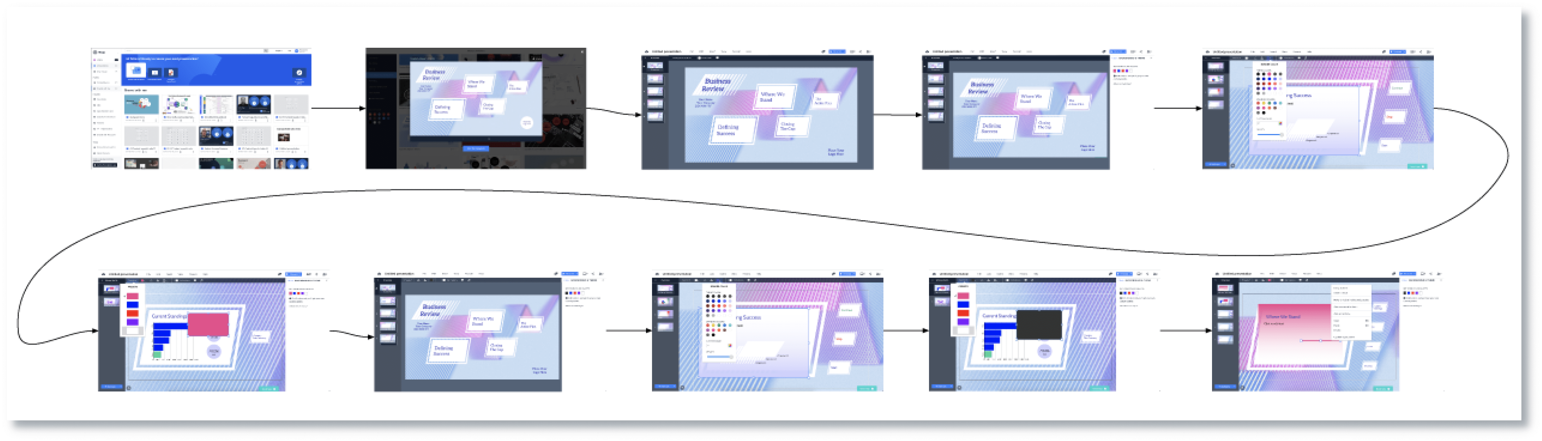
Based on a large number of support tickets, we knew that presentations were not adapting to changes made in the color palettes. For example, users would report “I am choosing my new color palette, however it is not changing in my presentation. What am I doing wrong?“
Most of these issues were rooted in legacy solutions from old projects. These solutions were more like hacky workarounds than a proper workflow.
Goal
Help new users style their first presentations easily. Give experts the ability to create freely.
Challenge #1
The most challenging part of the project was to focus on new users and experts at the same time.
Our approach was to offer novice users an easy-to-use solution while providing advanced users with more complex editing options, all without confusing or intimidating beginners.
Challenge #2
The magic always happens behind the scenes.
Another challenge was to figure out the apply logic to make sure that all elements are changing color when a new palette is applied, while also ensuring that text is always visible.
We provide default schemes, with colors that work well together
We offer pre-designed color templates to make coloring easier for novice users. With just one click, the entire presentation can be easily recolored at any point during the creation process.
Coloring options can be found under the Style section, which displays color templates in the color sidebar. This provides access to all color-related settings that affect the entire presentation.
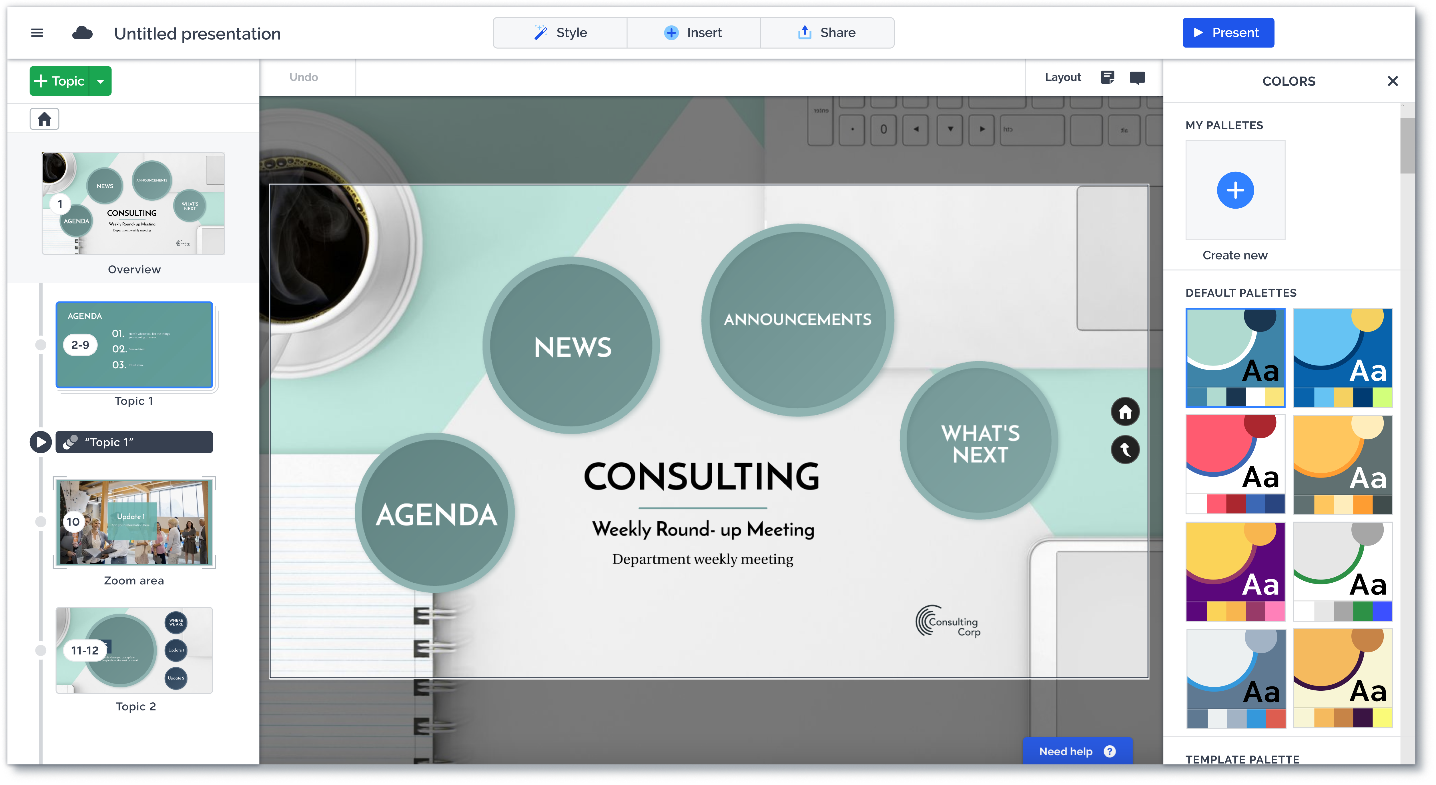
In the code base, there were 5 style classes for color and 2 for text, which we were unable to modify. As a result, we had to figure out how to assign color presets to Prezi objects and shapes in a way that same colors are never overlapping.
Each color scheme consists of 5+2 colors. The 5 colors are used for non-text elements, the +2 are for texts. When a scheme is selected, we apply the colors on the presentation, according to a mapping logic below.
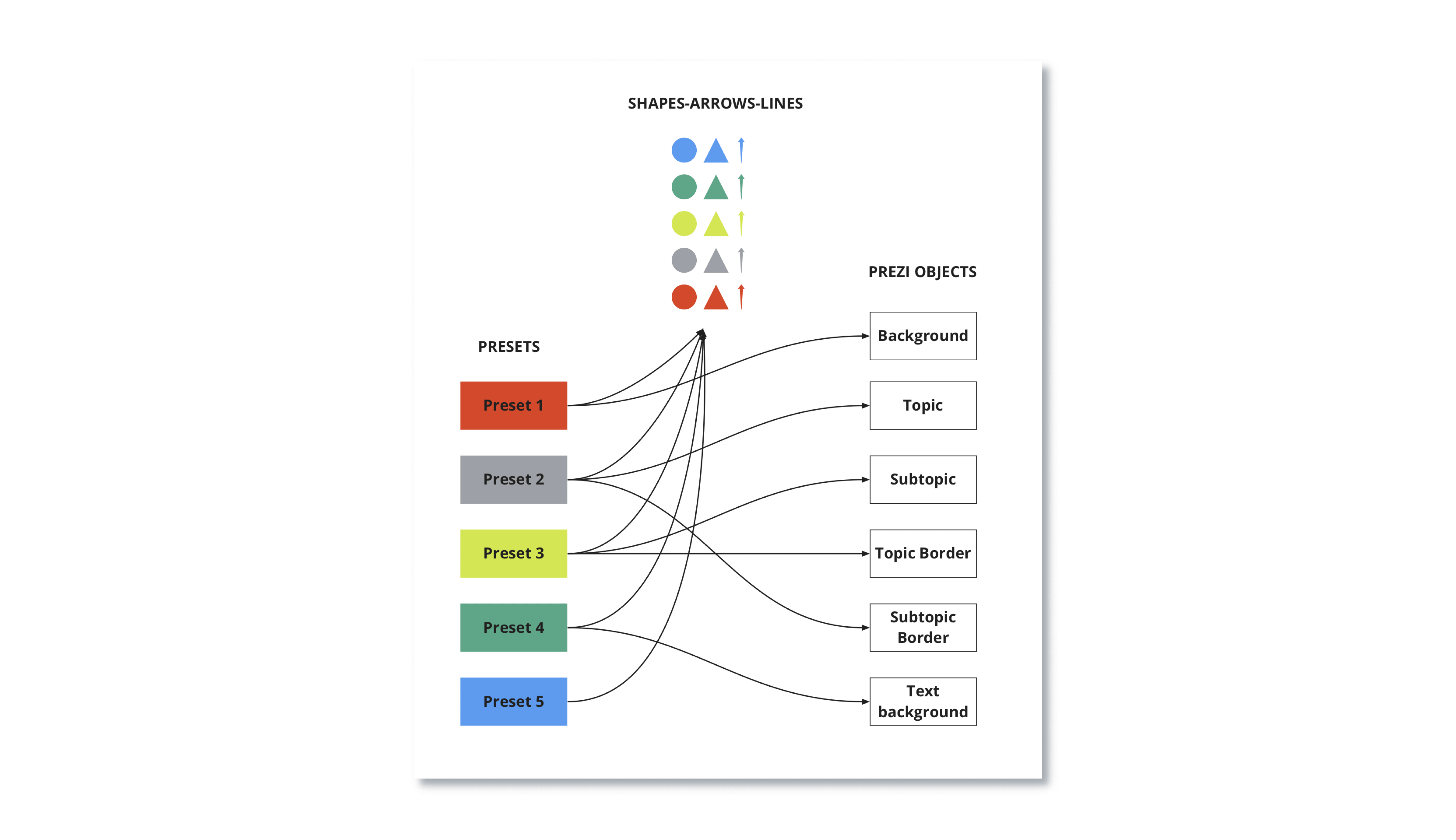
Additionally, a team of template designers had to update over 100 Prezi templates to use presets instead of inline colors and set color palettes to match the mapping logic mentioned above.
People can also create custom schemes
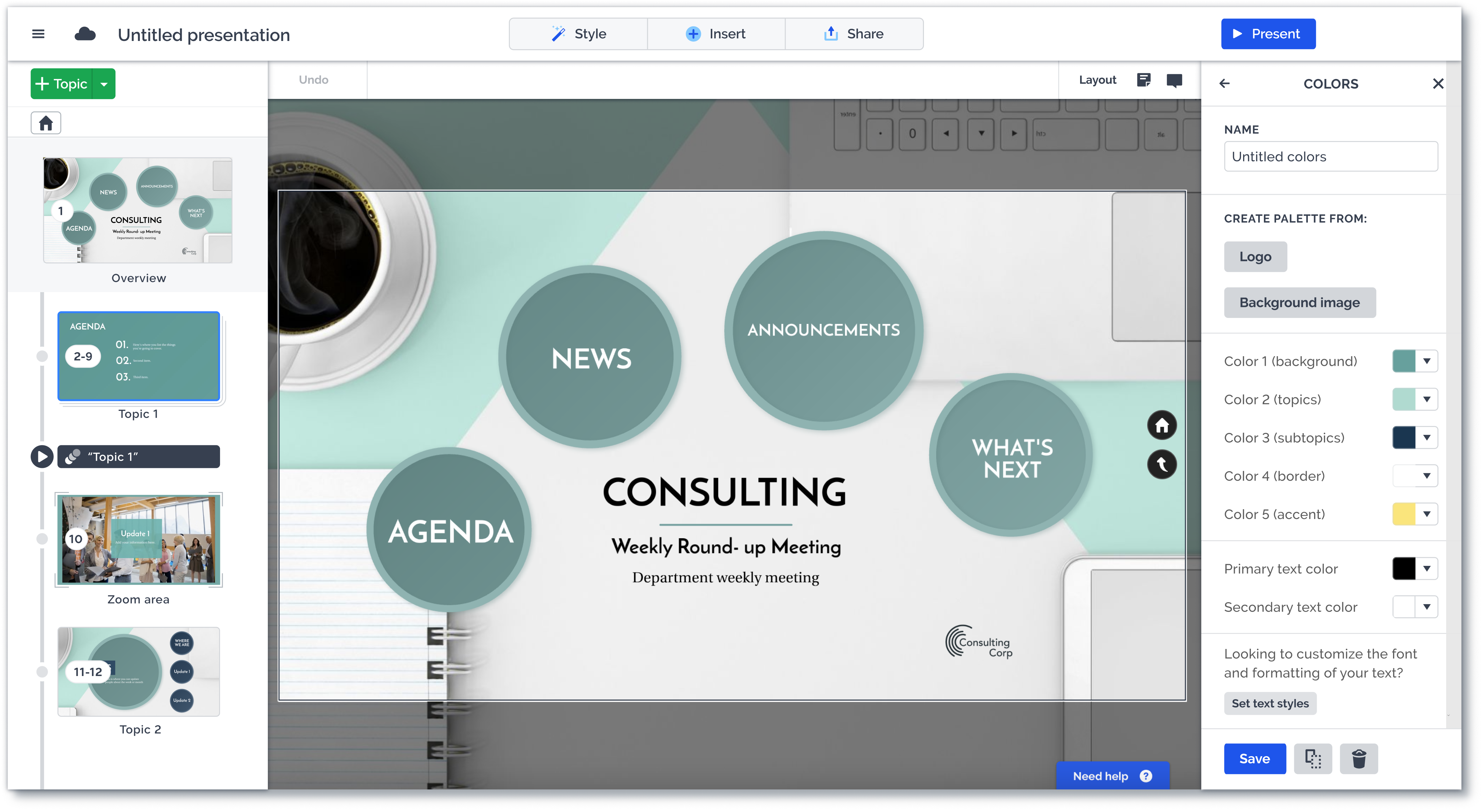
Advanced users have the option to create their own color palettes or edit the pre-designed section with the ability to customize each scheme to their liking. They can choose to save changes to the existing scheme or create a new one, with customization fields for Theme colors (1 to 5) and Text colors (primary/secondary). And of course, there is an option to recolor individual objects irrespective of the color palette.
Results
Technical background
Using Prezi API allowed us to take a systematic approach to sidebar redesign. We created reusable, sidebar width components and started using only these building blocks to create unified sidebars. This approach resulted in a consistent design and significantly faster implementation.
Expanding the project
Thanks to the Color project, we managed to streamline the design of Prezi's sidebars, resulting in a more consistent appearance and faster implementation.
After the Color project, we began to work on making Text style selection as seamless as Coloring. Previously, there was no way to globally change Text styles in a presentation. Our approach was the same as with the Color project.
We expanded the project to include redesigns for the background, image, icon, audio, and video sidebars. However, we encountered larger questions about the purpose of a sidebar and decided to put a more comprehensive editor redesign on hold.